


Recent
Most read

As we wait for this yearŌĆÖs exam results, hereŌĆÖs a question: what do you think the overall distribution of exams grades will look like?
YouŌĆÖd probably assume that grades would be evenly distributed with a peak in the middle, tailing out either side towards the higher and lower ends.
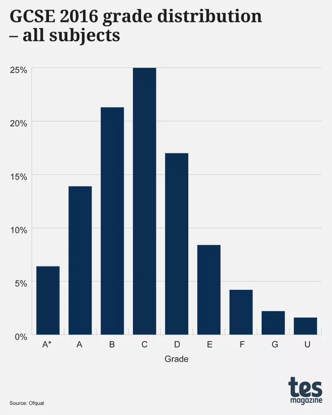
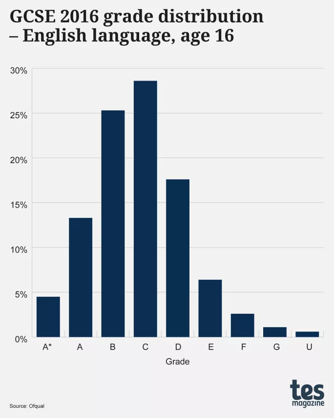
Certainly if you go back a few years, youŌĆÖd be right - as shown below, the graph for 2016 GCSEs graded A*-U shows a near-perfect bell curve.
╠²
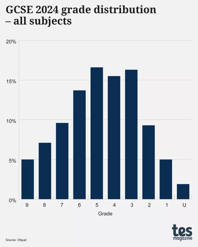
However, go back to last year and something very different is seen - a shape that has two peaks, at grades 3 and 5, with a dip at grade 4.
╠²
This is somewhat puzzling.
For large cohorts - 4,816,279 certificates in 2016, and 5,677,954 in 2024 - youŌĆÖd assume there would always be a bell-shaped distribution - but clearly not.
ItŌĆÖs as if the 2024 distribution has ŌĆ£too manyŌĆØ awards at grade 3 and ŌĆ£too fewŌĆØ at grade 4 - which, given the significance of the grade 3/grade 4 boundary, might raise a few eyebrows.
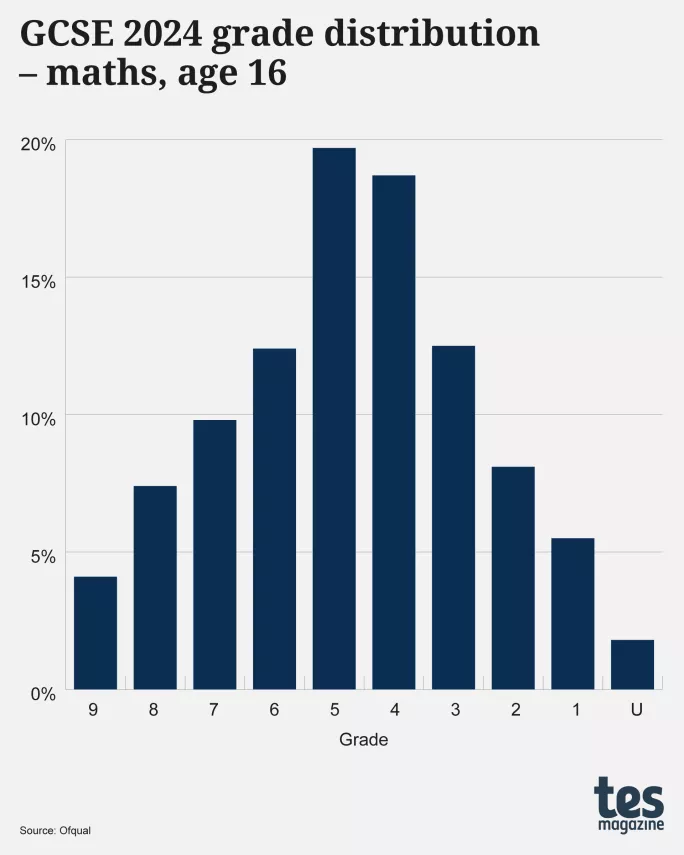
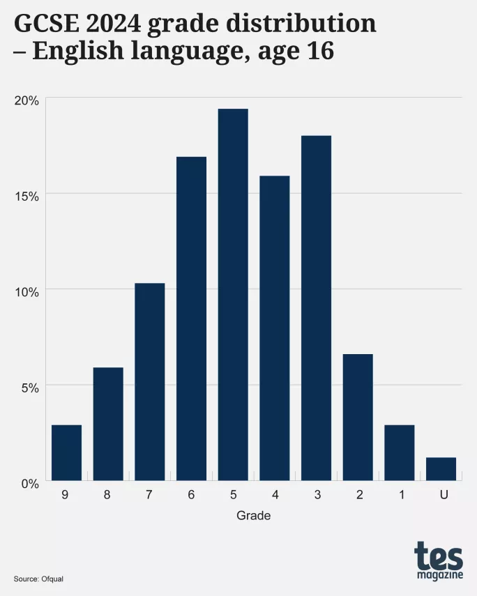
Those eyebrows will raise even higher when you take this same question about grade distribution and look at GCSE English language and maths - two subjects in which GCSE students must achieve a grade 4 to pass.
Something odd happens here, too: the distribution for maths has a single peak at grade 5 and is reasonably bell-shaped.
╠²
English language, however, is different, with an ŌĆ£over-populatedŌĆØ grade 3 and ŌĆ£depletedŌĆØ grade 4:
╠²
Yet the distribution for GCSE English literature is a bell curve:
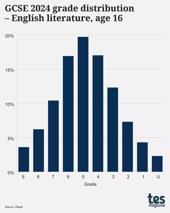
╠²
Given that many of the 601,315 students who took English literature were the same as the 630,835 who took English language, why are the distributions for these subjects so different?
Importantly, this difference cannot be explained by English language resits, for the charts both relate to students aged 16.
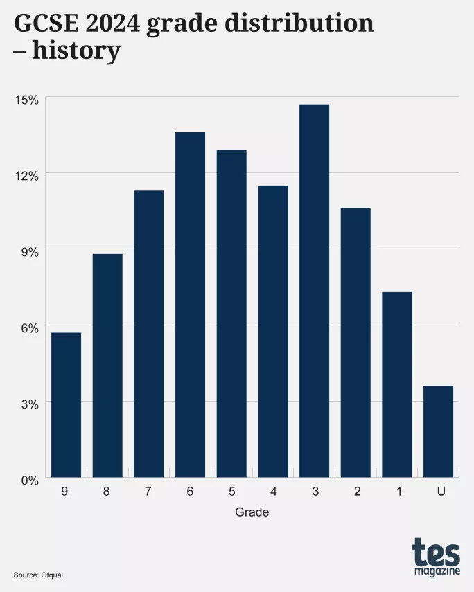
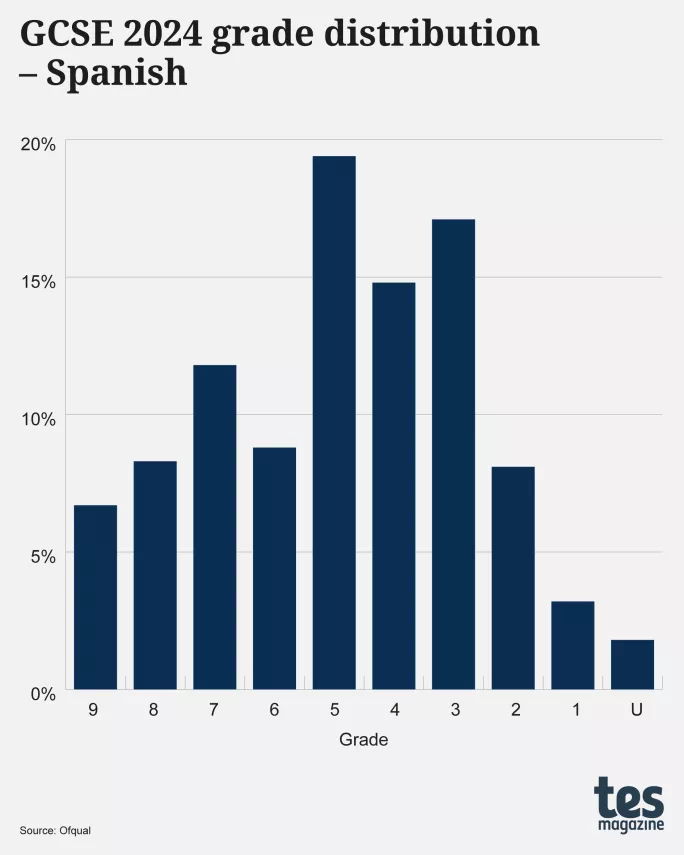
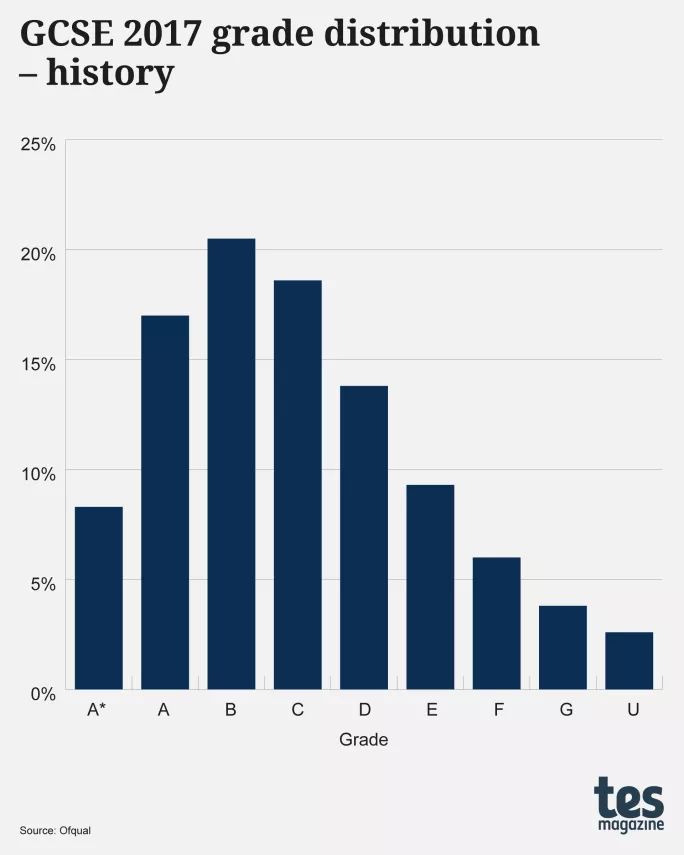
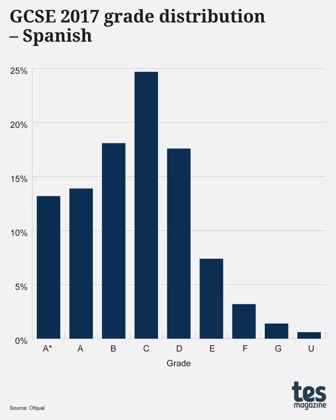
English language is not the only subject to show a multi-peaked distribution either: the graphs below show two further examples for GCSEs in 2024, history and Spanish (both for all ages):
╠²
╠²
╠²
The distribution for history, like that for English language, has two peaks: one at grade 3 and the other at grade 6, with the dip straddling both grades 4 and 5.
Spanish, too, has a peak at grade 3, and also at grades 5 and 7, with two intermediate dips at grades 4 and 6. This three-peak distribution is most strange. Why would a cohort of 127,830 students have fewer who merit grades 4 and 6 than those who merit grades 3, 5 and 7?
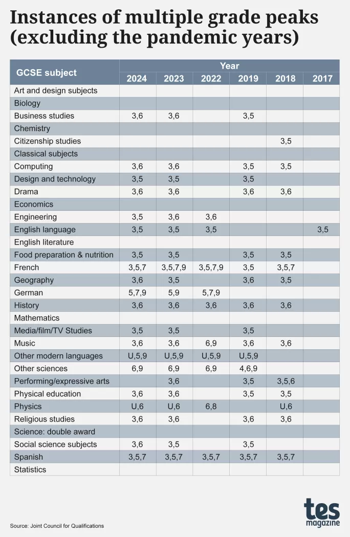
Nor are these examples unique. Over the past decade, there have been some 80 instances of multi-peak grade distributions, as shown in the table below, which lists the different grades at which the peaks appear:
╠²
Some of the peaks in the table above are likely to have simple explanations, such as the peaks at grade 9 for French, German and other modern languages, which could well be attributable to native speakers taking the exams.
But of the 80 occurrences shown in the table, 67 have a peak at grade 3, of which 38 are associated with a second peak at grade 5, and 27 a second peak at grade 6. How might all these be explained?
While considering this it is worth reflecting on the reality that there were no instances of multi-peak distributions in any AS- or A-level subject, nor in any GCSE subject, graded A*, A, BŌĆ” (as opposed to the new numerical grades). This is exemplified in the graphic below, which shows the grade distributions for GCSE 2016 English language (age 16), GCSE 2017 history and GCSE 2017 Spanish, these being the last years when those subjects had ŌĆ£alphaŌĆØ grades:
╠²
╠²
╠²
So, why do multi-peak distributions appear only in GCSEs graded 9, 8, 7ŌĆ”, but not when the same subjects were graded A*, A, BŌĆ”, nor in any A-level subjects?
Why is there predominantly a peak at grade 3 and a dip at grade 4?
That second question is, to my mind, particularly important.
ThatŌĆÖs because, if the grade 3/grade 4 boundary were to have been set one or two percentage points lower, then the number of students awarded grade 3, commonly termed a ŌĆ£failŌĆØ, would have been fewer, and the number awarded grade 4, a ŌĆ£passŌĆØ, correspondingly higher, restoring a more bell-like shape.
We can see this by creating our own interpretation of where the raw marks for English language GCSE would have been last year, as the graph on the left shows (which closely matches the actual grade distribution, giving us confidence in the interpretation), and then adjusting the grade 3/grade 4 boundary by just one percentage point, resulting in a near bell-shaped distribution. This underlines how key these boundary decisions are to grade outcomes.
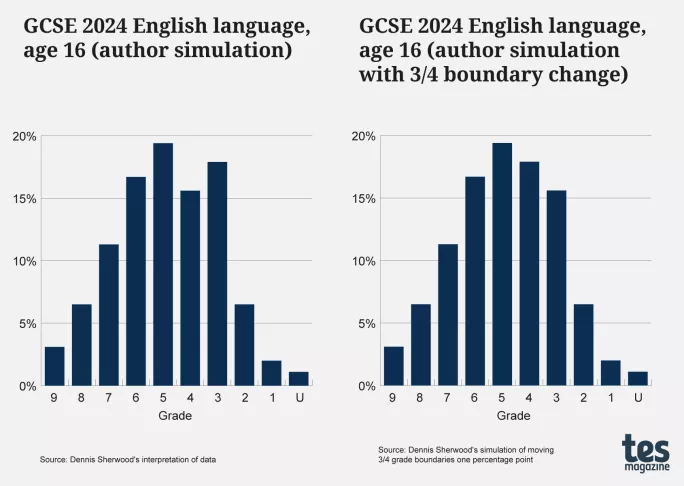
╠²
This, then, throws the spotlight on to how that crucial grade 3/grade 4 boundary is determined. Why, for any subject, is it ŌĆ£t│¾Š▒▓§ŌĆØ value rather than ŌĆÖŌČ─£t│¾▓╣│┘ŌĆØ one?
Many other subjects like maths, biology, chemistry, English literature and art and design subjects, for example, have all consistently maintained reasonable bell-shaped distributions even with numeric grades.
It will certainly be interesting in August to see how grades - both overall and by subject - have been distributed and where bell curves - and non-bell curves - are found.
Dennis Sherwood is author of : why so many school exam grades are wrong, and how to get results we can trust
You can now get the UKŌĆÖs most-trusted source of education news in a mobile app. Get Tes magazine on and on